So I set off with to play with the panpastel tools. I took a few colours and just applied them to paper to see how the tools would respond to my touch. I tried paining a purple tulip and discoverd how not to use the tools. And which tool would produce which stroke. I wasn't very satisfied the way things worked out though. Mostly the pastel was applied in blobs and the blending was bad. But when I started on the leaves I figured out how to blend better. In the end it was an ok painting. I was on my way to learn how to use this new medium. I wasn't convinced yet this was the medium for me. But after all this was just a quick scetch. So I was ready for a bigger paper and a bigger challenge.
Blogopmaak
MaKe Arts Blog
contact@makearts.nl
Panpastel.
Since 2 weeks I am proud to have the complete panpastel set of the 80 colours. Black Friday sale has made me spend some money but the discount was too good to ignore. I have never used panpastel before. But I have seen many you tube vides that convinced me to buy the set and start working with this medium.

My next project was to paint another flower: a dark red lily. But this time on the famous Panpastel Clairefontain paper. With the first stroke I found out what happens when the paper has so much tooth, that it grabs the colour like glue. I was surprised and had no clue how to blend the colours any more. The skill I had vaguely learned with the purple tulip on multi-media smoothe paper were no use on this rough paper
.
I plodded on and dabbed colour to the paper. Tried to place the colours on the right spot with the tools that seemed too big and wide for any work with the panpastel. Blending seemed impossible as well. In the end i just struggled and finished the painting by just applying the colours and the shape. I was tired of it as it didn't seem to do what I want it to do. I tossed the painting aside as soon as I though it had a finished look to it. I was thinking that panpastel paper was horrible. Many artists do not agree and praise tihis paper. But for me..... I needed to learn more first.
It only dawned on me 2 days later that smaller details I could add using the pastel pencils. I could still add those but for the sake of learning to use only panpastel tools I left the painting as it is. The soft blurry edges and paint strokes are clearly visible but maybe that makes this drawing a bit more charming as well. And although I did not like it at all when I was working on it. It looked actually pretty ok after I looked at it again some time later.


Next stop was a smoother paper so I could learn to blend better. I took a refernce photot of a leave with drops of water. The limitted pallet would help me to focus more on the blending techniques. And it was the first try on more smooth paper. It was a good try to learn to blend more and how to handle the tools. I did some detail work with pastel pencils but all the green bored me in the end and I was ready for a new challenge.
My goal was always to paint portrets. So I could not resist any longer and my next aim was to try a portrait. I went to the internet to look for a decent copyright free photograph so I could use that as a reference. I again picked a more smooth paper: Pastellmalblock from AMI.
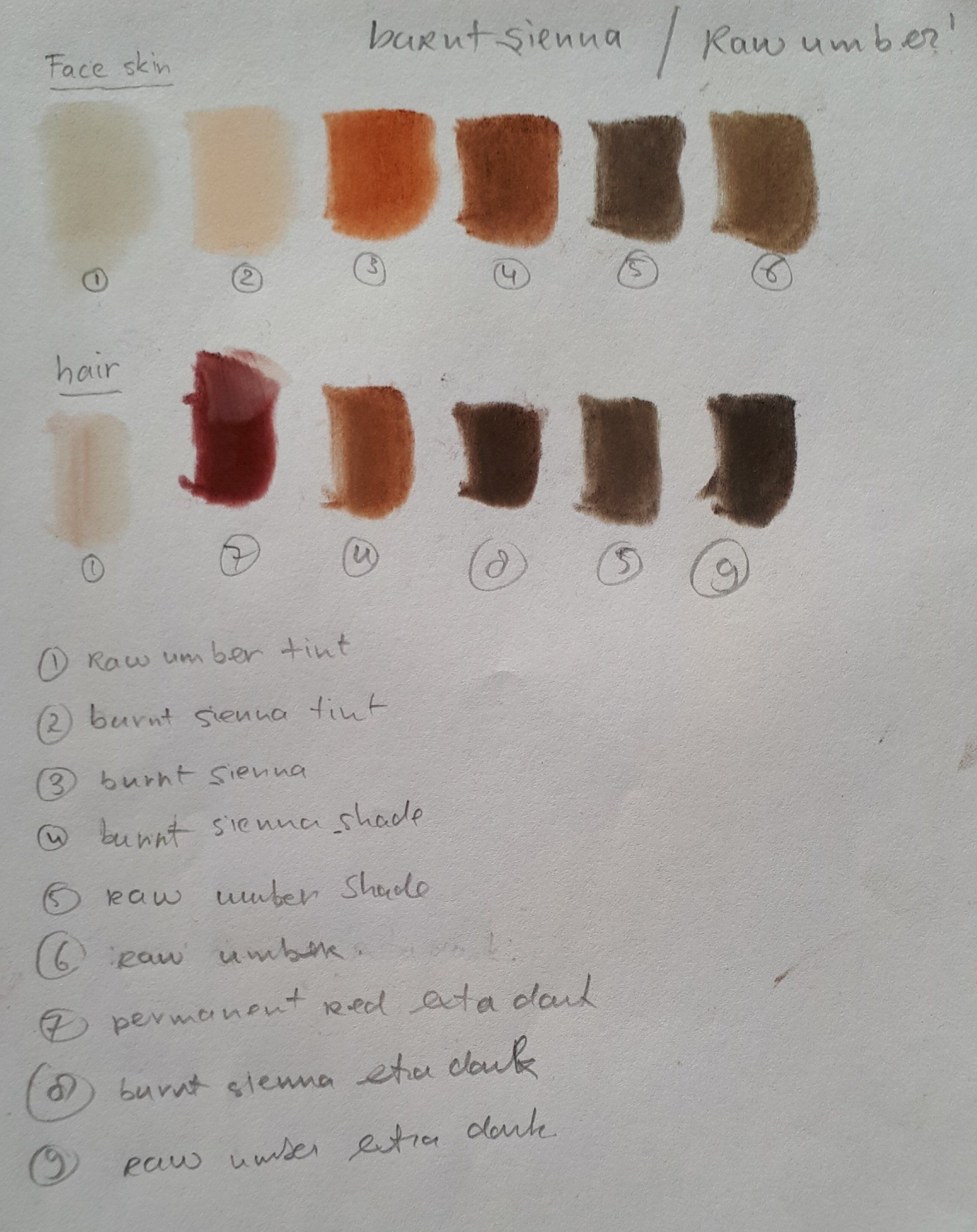
The most challenging for me is to get the proportions right. So I cheated a bit and used graphite paper to copy the outlines of the face and the positions of the eyes, nose and mouth. I looked at the colours and at my 80 pans. Too many colours to use them all. So I chose 2 rows of pans that seems to come close to the colours in the reference photo and decided not to add any other. I chose burnt siennas and raw umbers. Later I added the permanent red (extra dark) as well for the lips as that colour gave a dark warm touch to the painting and added more depth/contrast. So I added a bit of that red to the eyes, hair and clothes.
As all pastel is very fragile to touch, I decided to use a spray fixative to preserve all the pastel painting I have made so far. For that I used Talens 064 fixative for pastel.
I did my best to make this portrait work for me. It pays off if the motivation is high and your heart is in the right place for a painting. I really am proud of the outcome. My real first colour portrait with pastel. Although there are some things I am not totally happy about and small things I could improve next time, but whenever I look at this portrait, I only can feel pride.
I just love the way it turned out.
MaKe Arts - December 2019


Finding inspiration and motivation for new art projects